30.3.12

Tao of Tableau - The Amazing Mystery Tooltip

While I was preparing a series of dashboards visualizing the tides on Panama's Pacific coast for ocean activities planning I came across an unusual situation: one of the visualizations I created has two distinct and separate tooltips, only one of which I put in place. The other shows up and there's no way I've found yet to get rid of it. Here's a stripped down version of the workbook showing this oddity:
This is a weird little anomaly. The explanation for its occurrence, as far as I can tell is contained in the "The Explanation" dashboard, and follows here:
As near as I can figure out, the mystery tooltip is an artifact left over from the construction of the visualization.

This viz is a dual axis graph, with the left vertical axis presenting the line graph, and the right axis presenting the marks as circles. This is a pretty common technique for creating line graphs with emphasized marks for the actual data points.

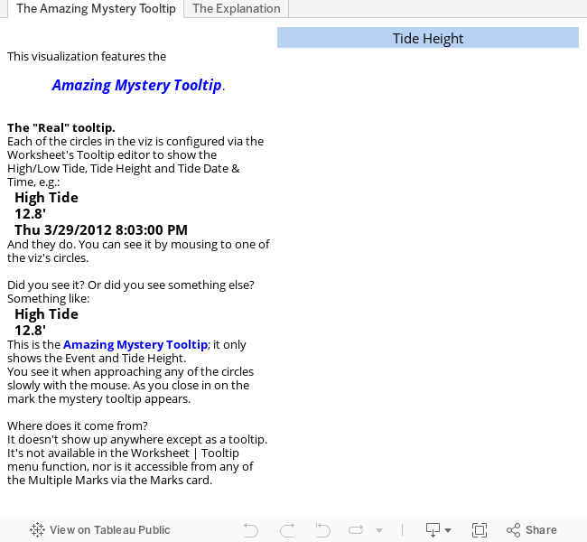
The Worksheet's Tooltip, the desired one showing Event, Tide Height, and Tide Date and Time, is configured for the circle graph. The intention is to provide tooltips that expose the desired information.

The line graph has an implicit tooltip, the Mystery Tooltip.
Given the construction on the viz, it is inaccessible for configuration, and presents itself when the user is looking for information.

The line graph tooltips are activated when the mouse comes within range of one of the graph's line segments. This activation range is wider than the activation range of the circle's tooltips, so the line graph tooltip first when the mouse approaches a circle.

This presentation of the Mystery Tooltip is problematic for a number of reasons, the most important being that it's a source of confusion for the person viewing the viz. Sometimes they see one tooltip, sometimes another; this is bad.

Everyday BI - Tableau helps with learning Spanish

I've been in Panama for a couple of months, and trying to learn Spanish. The classes I've been taking are very helpful and I'm much further ahead than I'd otherwise be.

The past few lessons have become increasingly difficult—we're learning verbs, and there's a fair bit of complexity in the relationships between gender, conjugation, subjects, objects, verb stems (some get changed in conjugation, some don't) and so and so forth and such like.

I've been hand-organizing lists and patterns as we go, and this week reached a point where I see something of the "how" of verbs, and it occurred to me that if I could get a list of Spanish verbs and their characteristics it might be helpful to see if I could use Tableau to collate and organize them, and provide lookup  functionality to help find the right verb quickly.

After looking around the web a bit I came across multiple site listing Spanish verbs. So I picked one that seemed reasonably complete, pulled the data off, munged it up a bit, and created a Tableau workbook, which I then published to Tableau Public (below),

It didn't take long to get this up. The bulk of the time was spent munging up the data (a topic for another post), followed by the inevitable fiddling around with presentation and functionality. It's not perfect—there are data problems to be fixed, and I'm undecided on whether to make the verb-finding functionality more capable, but as a first blush effort it's not too bad.

The is an illustration of how the principles of BI can be applied in local, personal situations to help real people (me) achieve information and insights from raw data. BI isn't just for Big Companies any more, it's for everybody.

Better BI's new home.

This Better BI blog has been humming along on another blogging platform (here), but there's something I need the blog to do that the other platform doesn't allow: embed data visualizations I publish to Tableau Public. So I'm trying out Blogger to see if it's possible, and hopefully easy.

About Tableau, and why I need to embed visualizations.

One of Better BI's tenets is that information is best unlocked from data when the barriers to discovery and communication are minimized. Tableau is the best tool I've found in 25 years in BI for use in exploring data; it's not the only tool in the box, but it's the first one I reach for, and the most used.

Discovery
Using Tableau, I can instantly start exploring new (or familiar) information, and discover valuable things about it.

Communication
Tableau provides multiple options for sharing analyses, ranging from copy/pasting images in documents, to producing PDFs, to distributing functioning Workbooks with the free Tableau Reader (similar to Adobe's PDF reader).
But the best option for sharing is to publish to Tableau's publicly available and free server product: Tableau Server. Once published, the analyses are web-available to the public.