As near as I can figure out, the mystery tooltip is an artifact left over from the construction of the visualization.
This viz is a dual axis graph, with the left vertical axis presenting the line graph, and the right axis presenting the marks as circles. This is a pretty common technique for creating line graphs with emphasized marks for the actual data points.
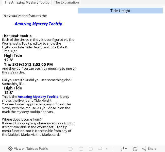
The Worksheet's Tooltip, the desired one showing Event, Tide Height, and Tide Date and Time, is configured for the circle graph. The intention is to provide tooltips that expose the desired information.
The line graph has an implicit tooltip, the Mystery Tooltip.
Given the construction on the viz, it is inaccessible for configuration, and presents itself when the user is looking for information.
The line graph tooltips are activated when the mouse comes within range of one of the graph's line segments. This activation range is wider than the activation range of the circle's tooltips, so the line graph tooltip first when the mouse approaches a circle.
This presentation of the Mystery Tooltip is problematic for a number of reasons, the most important being that it's a source of confusion for the person viewing the viz. Sometimes they see one tooltip, sometimes another; this is bad.
Update - DataViz Dude pointed out in the Tableau support forums that the problem is caused by a bug in Tableau's Tooltip rendering, thus:
ReplyDeleteTableau parses the content of the Tooltip prior to displaying it so that it can populate the Tooltip's data fields (those <...> things) with the proper data values for the mark the user is pointing the at.
When Tableau sees a field reference in a Tooltip that has no corresponding field in the analytical context it stops the processing of the Tooltip, including the line the unreferenced field is in.
In this viz, a dual axis graph, one of the axes has the Day of Week (DOW) added to its Level of Detail window in the Marks card, and was added to the tooltip in order to make it more relevant.
So... when Tableau is generating the Tooltip for a mark from the -containing axis the Tooltip is generated fully/correctly.
But... when Tableau is generating the Tooltip for a mark from the other axis (non--containing), the Tooltip is truncated to the line before the one containing .
There it is. Mystery solved.